It’s no secret that organizations are swimming in data. And when you’re not a data expert, it’s easy to get lost in the sea of information.
A useful, well-designed dashboard makes all the difference.

Dashboards provide self-servicing tools to even the least technologically savvy end users. But when creating a dashboard, it’s simply not enough to list all the relevant data. This data needs to provide meaningful insight into the businesses processes so that strategic, data driven business decisions can be made.
After building a solid foundation for what metrics the user must track, you then have to determine the most effective data visualizations. The perfect dashboard requires a balance between psychology and best practices.
Principles of Interpretation
In the 1900s, the Gestalt School of Psychology studied human perception through a series of experiments. It found six principles for easy interpretation of information:
- Proximity – Our brains can group multiple elements or forms together that are located near one another.
- Similarity – When objects are similar in shape, size, color or orientation, our brains will correlate them even when they aren’t grouped together.
- Enclosure – We perceive that objects are a part of a group if they’re surrounded by a border.
- Closure – When a figure is incomplete, our brains will create regions and fill in the missing elements.
- Continuity – We perceive aligned objects to be a continuous body or series.
- Connection – Objects or forms connected by a line will be seen as a pair or group.
These principles are a great starting point for dashboard design. The better you understand how the brain interprets information, the clearer you can make the data visualizations on your dashboard.
Dashboard Design Best Practices
Besides the Gestalt principles, there are three main concepts of dashboard design.

“Perfection is achieved not when there is nothing more to add, but when there is nothing left to take away.” ~ Antoine de Saint-Exupery
Your dashboard should only display information relevant to your objective.
In The Visual Display of Quantitative Data, Edward Tufte introduces the idea of a data-ink ratio. Data-ink is any element of a visual that can’t be erased without losing context or critical content. Non-data-ink is defined as any element that doesn’t contribute anything valuable to the objective. A well-designed dashboard will maximize its data-ink proportion.
Elements and practices that fall into the non-data-ink category include:
Overuse of color – Using every color of the rainbow isn’t necessary. Too many colors can be distracting and confusing. Also, don’t use colors that are too similar. If using different shades of the same color, make sure the shades are different enough to distinguish at a glance.
Logos – Unless sharing the dashboard with outside partners, users should know their company. Including in the company logo only takes up space that can be used for something more important.
Navigation – If you have to split up the information into multiple windows or use scroll bars to view a full graph or chart, you run the risk of users missing key information. Did you choose the most important metrics? Are you creating a data puke?
3-D elements – 3-D charts seem like a nice idea to add in some pizazz. However, the colors, shadows and axis inclination can easily skew the interpretation of the data. It’s better to keep it simple and stay 2-D.
Guide lines & borders – These should be used sparingly, when the context is absolutely needed.
“Dashboards are not an appropriate venue for artistic impression.” ~ Stephen Few
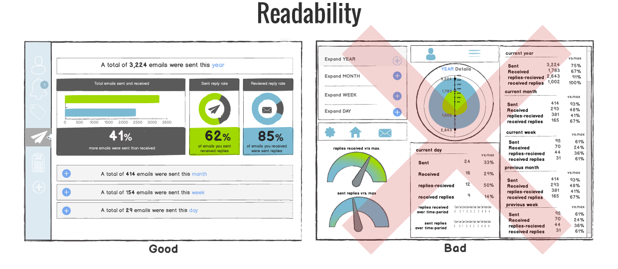
A major factor to keep in mind when creating a dashboard is where it will be viewed. Will the dashboard be shared with individual users on their own computers? Will it be on a TV screen in an office or conference room?
Some design elements that affect readability are:
Excessive precision – Depending on the end user, precise figures can be distracting or overwhelming. Rounded metrics and simplified details may be more appropriate for the dashboard. However, know your audience. Certain industries require precise figures and data.
Consistency – With dashboards, consistency is key for easy navigation. Keeping functions, filters and other options in the same areas for each dashboard will allow users to find features quickly and easily. Applying the same font, color palette and style will give your dashboards a more cohesive look.
White space – Without any white space between objects or widgets, your dashboard will look cluttered. This makes it hard to distinguish what information is the most important, as well as difficult to understand the information.
Visualizations – When visualizing metrics, don’t use multiple visualizations just because you can. Choose the best chart or graph to portray the information clearly. In its dashboard series, Geckoboard listed the best uses for different data visualizations:
- Number + Secondary Stat – To display a single measure
- Bar Charts – Showing data over a related series of data points
- Line Charts – Showing the relationship of data in the same series of data points
- Sparklines – To display a trend for a single data point
- Bullet Graphs – To display multiple data points in a small space
- Pie Charts – Only when the sum of the parts is equal to 100%

“Data isn’t like your kids, you don’t have to pretend to love them equally.” ~ Amanda Cox, New York Times
In its dashboard design guide, Juicebox stated that many times, the metrics chosen for a dashboard are metrics that an influential person thought were interesting. This is how a data puke gets created.
When choosing the core metrics and kpis to include on the dashboard, it is important to consider the dashboard’s audience and objective.
Once you have selected the core metrics and kpis, you have to create a hierarchy for the information. This can be done with the following practices:
Sizing widgets/sections accordingly – The point of a dashboard is to share complex company information in a way that’s easy to understand. Start by putting the most important information in the largest section and making the other sections smaller accordingly. You should use at most three relative sizes of widgets to make sure the dashboard isn’t overwhelming.
Group data logically – Grouping like data together will allow users to navigate through the information easily, especially when multiple users from different levels or departments are looking at the same dashboard.
Dashboards are great data management tools. However, it takes a more than putting a bunch of data points in one spot. You have to present the data effectively to make a dashboard a useful one.
 Choosing a BI vendor is all about finding the right fit. Our exclusive report will walk you through the process and help you select the perfect solution.
In what program/language would you make these dashboards? Thanks in advance!
Hi Hermann,
That’s a great question! The beauty of these best practices are that they can be applied to any language or solution you find best suits your needs. So I can’t point towards any one more than another.
If you’re trying to figure out which features and capabilities you need from a dashboard, we wrote a great guide on determining your needs and setting up a solid dashboard foundation. I’d also suggest looking over our BI software reviews to compare dashboard tools.
Best of luck!
nice post,thank you for submission.