
1985 was a big year – it saw the film debut of “Back to the Future,” the launch of New Coke, and the release of Microsoft Windows.
The familiar operating system has come a long way in the last three-plus decades since Windows 1 debuted. And the evolution of Apple’s OS has seen as great a change (if not more) since the 1984 release of the groundbreaking System 1.
Want to see what 30 years’ worth of technological innovation looks like? We’ve compiled a timeline of the design and interface changes undergone by the world’s most popular operating systems. Keep reading to see what went down.
OPERATING SYSTEM EVOLUTION
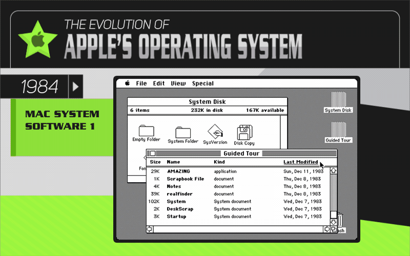
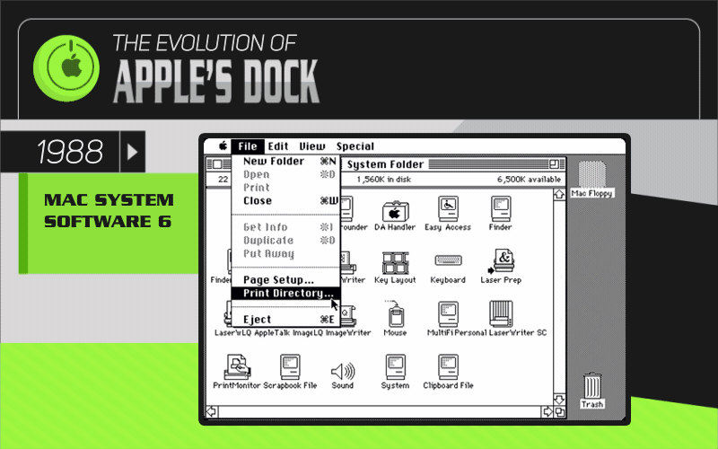
Apple’s release of System 1 in January 1984 introduced the world’s first graphical user interface (GUI) operating system. Every other computer until that point had run on a command line, so the GUI-based System 1 became the predecessor of today’s mainstream computing world. By the early 1990s, the system interface had introduced important computing features like the Hierarchical File System. This allowed for file storage in the branched directory format we’re familiar with today, plus the ability to drag and drop files throughout the GUI.
In 1997, Mac OS 7.6 was the first release to abandon the “system” name. Apple rushed to copyright its proprietary operating system – and to beat the threat of stagnation in the computer industry. Notable updates to the Apple user interface began in earnest in 2000, when Steve Jobs became permanent CEO in response to falling profits. A fresh interface design called Aqua was released with Mac OS X to breathe new life into the dated look and feel of past OS releases. It was glossy, modern, and colorful. It paved the way for the user interface that Apple devotees enjoy today.
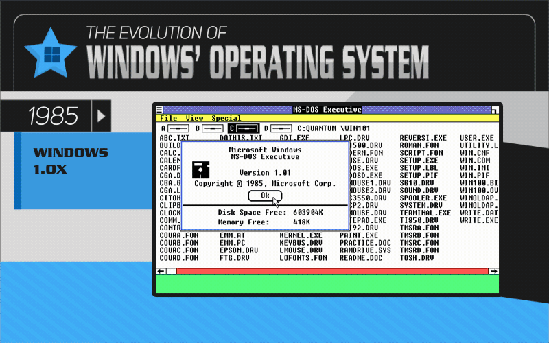
Similar to Apple’s System 1, Windows 1 was Microsoft’s first release that included a 16-bit graphical user interface. Bill Gates is recognized as the driving force behind the introduction of Microsoft’s GUI. Windows 1 also largely required the use of a mouse to control the operating system, but using a hardware mouse as a tool was still extremely rare in 1985. That’s why Windows 1 was released with a game called Reversi; it’s also why the Windows operating systems throughout the decades included games like solitaire and Minesweeper. It was all an attempt to familiarize users with computer controls through the mouse instead of the keyboard.
Windows 2 was released in 1987, and it was the first Microsoft operating system that allowed for flexibility with each program “window,” including minimizing and maximizing each window and even having multiple windows overlap. 1990 saw the release of Windows 3, which included a GUI update called the Commodore Amiga. Microsoft was finally poised to compete with the consumer-friendly Macintosh. Windows 3 also included a huge update to the style of the operating system, since it supported a range of 256 colors and modernized the interface’s look and feel.
In 2001, Windows XP introduced a whole new visual interface to the Microsoft product. The start button became a familiar green, the task bar was shaded blue, and a series of other visual effects laid the groundwork for the trademark Microsoft operating system interface that PC users are familiar with today. Since then, there have been many feature changes to the Windows operating system and even some updates to the aesthetic of the platform. But even today most of those features and visual choices can be traced to the Windows XP design overhaul of 2001.
DOCK VS. START MENU

With the introduction of the graphical user interface for consumer-friendly personal computers, both Windows and Apple saw an urgent need to introduce an easy way for users to quickly launch programs and applications. Windows operating systems throughout the years have relied on the Start Menu, which was first introduced with the release of Windows 95 in 1995. Microsoft launched the Start Button and Start Menu with a star-studded advertising campaign in order to convert users to the new program-launching process. It wasn’t until 2001 that the Start Menu began to look much the same way it does today, with the inviting green color that Windows users are accustomed to.
When Windows 8 was released in 2012, Microsoft made big changes to the Start Menu by switching over to a full Start screen that was specifically designed to be compatible with new touch-screen machines. The Start screen focused on application icons and clickable tiles – much like Apple’s Dock – instead of the list of system options and programs that Windows had relied on with the Start Menu of previous years. 2013 saw the release of Windows 8.1, which brought back the Start Button to launch the Start Screen to appease Microsoft customers who had grown to rely on the Start system. In 2014, Windows 10 reintroduced the beloved Start Button and Start Menu, probably for the sake of familiarity and ease after investing so much in conditioning customers to use the Start system.
Meanwhile, the Dock that Apple users are familiar with today was initially introduced in 2000 with the release of Mac OS X, affectionately referred to as Cheetah. Until 2000, Apple OS users relied on the menu bar to launch and select programs and to make changes to applications already running. When OS X 10.5, also known as Leopard, was released in October of 2007, the Dock had been redesigned with the same visual approach used today. The program selection in the Leopard Dock was completely customizable, indicated which programs were already open, and featured variable icon sizes and slick animations to draw attention to the cursor’s selection.
SYSTEM ICONS
![]()
![]()
The first icons released with Apple’s System 1 interface in 1984 have become something of a cult obsession for Apple enthusiasts. They were originally designed by Susan Kare, and their 8-bit likenesses are often used today as a friendly pop culture reference to the early days of computer interfacing. The icons that Apple launched with OS X and the Aqua system interface are closer in design to the icons still used in today’s Apple operating system.
Aqua came with a series of blue icons, many of which are still in use today albeit in updated versions. The fundamental Finder icon has kept its basic shape over the years, as has the Trash icon. Andmany of the obvious changes to Apple’s program icons were based more on necessity than style change: for example, the video camera icon representing the iMovie application that was introduced in the 2000s.
Windows 1 made Microsoft’s first GUI available with a series of 16-bit icons similar to Apple’s classic 8-bit series. The Windows icons became more complex with each new operating system release and increased bit capability, but it wasn’t until Windows XP in 2001 that the icons first resembled the modern, shadowed, and more realistic icons that computer users in the digital age have come to expect.
Similar to Microsoft’s design trajectory with the Start Menu, the Windows icons included with the2012 release of Windows 8 diverged from the familiar path. The stylized icons were settled into a tiled, uniform design format that aligned with increasingly popular touch-screen capabilities and the Windows 8 Start screen release. But by the time Windows 10 was released in 2014, Microsoft had returned to the more defined, purpose-inspired icons to represent its system features and various programs.
THE EVOLUTION OF THE LOGO
![]()
![]()
From its founding in the 1970s, the Microsoft logo went through many iterations of typography and stylized letters to express the company name. The logo went through a groovy version inspired by the disco lights of the 1970s, followed by the famously green version that focused on a stylized letter “O” in the 1980s. Microsoft then settled on its most recognizable version: the commonly known“Pacman” version of the brand name, in italicized letters with a slash in the middle to represent speed and forward motion.
When Microsoft started incorporating visual representations of physical windows in its logo, the company constantly struggled to distinguish the four windows from what was commonly interpreted as a flag. The current version of the Microsoft logo that features four windows of red, green, blue, and yellow has been in use on and off since the 1990s.
The next major change to the Apple logo was introduced in 1998, when the rainbow logo was pared down to a monochrome version of the shape. In the 2000s, the Apple logo went through different versions of stylized grayscale with 3D shading and shadows to bring the logo to life off the page or screen. Over the years, Steve Jobs’s initial idea to keep the Apple logo as a symbol of something people recognize and can use easily has been a powerful part of Apple’s company lore.
CONCLUSION
Over the course of 30 years of innovation in technology and design, what it means to use a computer has become a wildly different experience. Nowadays, it’s easy to take for granted much of the interface design and computing power that our devices pack into compact machines and high-resolution screens.
But since 1985, companies like Apple and Microsoft have competed with each other and with the clock to stay at the forefront of technological innovation, hoping to move their newest operating systems from store shelves to desks everywhere. The change these operating systems have undergone in 30 years represent leaps forward in the world of technology and reflect our evolving needs and desires as consumers living in the digital age.
SOURCES
- http://www.theguardian.com/technology/2014/oct/02/from-windows-1-to-windows-10-29-years-of-windows-evolution
- http://mashable.com/2012/02/17/mac-os-timeline
- http://www.techrepublic.com/pictures/the-evolution-of-windows-icons/
- http://www.cultofmac.com/191340/the-evolution-of-ios-from-iphone-os-to-ios-6-gallery/
- http://blogs.tribune.com.pk/story/19792/the-evolution-of-the-apple-logo/
- http://www.businessinsider.com/microsoft-unveils-new-logoheres-a-history-of-the-designs-evolution-2012-8
FAIR USE
Please share the information and graphics on this page as you wish. We ask that you remember to attribute Better Buys by linking back to this page and Better Buys, so your audience can view the original project and sources.